Mapbox + Ocean Seeding
By @RobLabs
Oceaneos + Ocean Seeding
Maps tell stories. NASA satellite images of the color of the ocean can also tell a story. We will discuss a geo-imaging pipeline for processing a time series of NASA satellite images, hosting on Mapbox, and using D3.js and Plot.ly to interactively visualize data from our oceans over time.
ePi Rational built an imaging & mapping pipeline for Oceaneos.org that processed NASA satellite images to visualize trends in phytoplankton in the ocean. Oceaneos is studying Ocean Seeding. A simple idea: that adding nutrients to a depleted marine ecosystem will stimulate photosynthesis, causing plankton to grow, thus restoring the bottom of the marine food chain that fish require for growth.
We will discuss our geo-image pipeline for processing NASA GeoTiffs using GDAL and hosted at Mapbox.com, and other open source Javascript libraries for data visualization. We also utilized NumPy to compute basic statistics on the GeoTiffs. We will also discuss our data compression techniques for operating on floating point GeoTiff data, as well as image compression with WebP.
The implemented web page design is built on top of D3.js and a Plotly.js time series graph at the bottom of the map. When the user clicked on a particular date, the Mapbox map would also update to the chlorophyll levels time series for a time slice in the 13 year span. Plotly.js events are captured and routed to Mapbox GL JS, which then makes updates to the map with images from Mapbox.com.
More on Oceaneos
For further scientific details on Ocean Seeding and phytoplankton, please see the blog post at Oceaneos.
- Oceaneos Environmental Solutions — http://oceaneos.org/2017/02/oceaneos-world-chlorophyll-map/
- Global Chlorophyll Map — http://oceaneos.org/chlorophyllmap
- What is Ocean Seeding? — http://oceaneos.org/ocean-seeding/what-is-ocean-seeding/
- YouTube — What is Ocean Seeding? A New Technology that can Save Marine Life
Mapbox & Plot.ly
- NASA GeoTiffs were processed using GDAL and hosted at Mapbox.com.
- The implemented web page design is a plotly.js time series graph at the bottom of the map which showed chlorophyll levels over a 13 year span.
- When the user clicked on a particular date, the Mapbox map would also update to that time. Therefore giving a visualization over time.
- Plotly.js
eventswere captured and routed to Mapbox GL JS, which then makes updates to the map with images from Mapbox.com
- Plotly.js
- Built on top of d3.js and stack.gl, plotly.js is a high-level, declarative charting library.
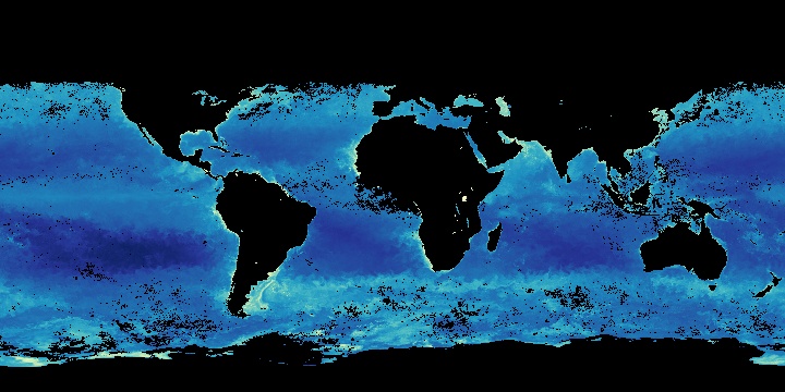
Data from NASA
From the NASA Earth Observations (NEO) mission statement
“Welcome to NASA Earth Observations (NEO)
One of the best places to study Earth is from space. NASA satellites continually orbit the globe, collecting information about Earth’s ocean, atmosphere, and land surfaces. Satellites can even monitor the activity of life forms, such as phytoplankton, from their remote vantage points.
NEO is part of the EOS Project Science Office located at NASA Goddard Space Flight Center.””
Raw Data
- The raw data from NASA comes from the NEO Server, http://neo.sci.gsfc.nasa.gov/view.php?datasetId=MY1DMM_CHLORA&date=2016-07-01
- The images available in NEO are freely available for public use without further permission. ePi was diligent to credit NASA Earth Observations as the source in the Mapbox map.
- The NASA satellite images are sampled at these time series intervals
- One image per month. Processing over a 13 year span would be approximately 120 RGB raster GeoTIFF images at 2 MB per image.
- One image every 8 days. Processing over a 13 year span would be approximately 500 floating point GeoTIFF images at 3 MB per image.
- Oceaneos chose to compute their computations for the graph from statistics on the 8 day samples
- Computations of raw data was done from floating point GeoTIFFs using Numerical Python
- The 8-day floating point GeoTIFFs were much smaller to download, and 10 times faster to process than the corresponding 8-day CSV data files
Upload to Mapbox
- The Upload api is from Mapbox, and is a Python based command line script
- Several files can uploaded at once and the status of uploads is monitored within the Mapbox account at Mapbox.com/studio
Live Mapbox Map Example
- Zoom on the map to inspect Chlorophyll Concentration based on NASA NEO’s Ocean Color models
- Click on the time series graph to investigate the concentration over time.